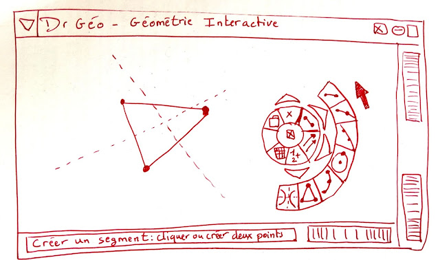
In Dr. Geo, to edit a sketch, the user frequently changes its editing mode: to construct point, segment, straight line, ray, line, move a geometric object, etc. There are tenth of editing modes. To switch from one mode to another one, the user selects a specific menu entry or click on a specific button. In the following paragraph, I discuss about a circular toolbar design.
Right-clicking anywhere in the Dr. Geo window opens the circular toolbar. The top level buttons previously selected of each category are displayed circularly: file operations, points, lines, geometric transformations, numeric computations, macro-constructions, scripts use and editing.
To access the other editing modes of one particular category, the user clicks on the small triangle over the visible button. Then it shows a sub circular toolbar populated with all the possible editing modes related to this category. Once a button of this sub toolbar is activated, Dr. Geo switches its editing mode accordingly and the button becomes the top level button of its category.
The whole toolbar is moved around by dragging it from its inner center. I am still in the process of exploring its usability. Some concerns were objected about the understanding of the editing mode behind each button. A menu entry with a textual description is easier to understand, particularly for a new user of Dr. Geo.
What do you think ? Is a menu entriy offer a better user experience than a button with an icon ?


Aucun commentaire:
Enregistrer un commentaire